Newspaper Ad
In this project, we were given the task to design and make an ad that would be shown in a newspaper, whether online or physical. This helped us learn more about conceptual thinking, organized layout, and regard to how images/photos/typography will work together. We also got to understand how much consideration should be taken regarding newsprint paper and its properties.


Research & Brainstorming
So of course, we need to figure out what newspaper ads look like, what size is required and more. I took some time looking around at paper ads I liked, and I also looked around at some travel agencies and their ads since that is the company I’d be making the ad for. Then I jotted down my ideas for topics, headlines and more, as well as some first visual ideas.


Sketches & Doodles
Once I had some ideas flowing, it was time to start getting them down on paper to see what works best. I had three ideas that I started finagling with and tried different layouts and designs with each of them to see how they looked. It was very helpful to get my ideas out quickly like this so I could move to the next step with a better idea of what I was doing.


3 Thumbnails
When the sketches and doodles were done, it was time to start making some tight thumbnails. As you can see, I have more than three as I tried more ideas and had to figure out margins and placement. This was a super helpful step to see how everything fits together and to try different things that might work better.


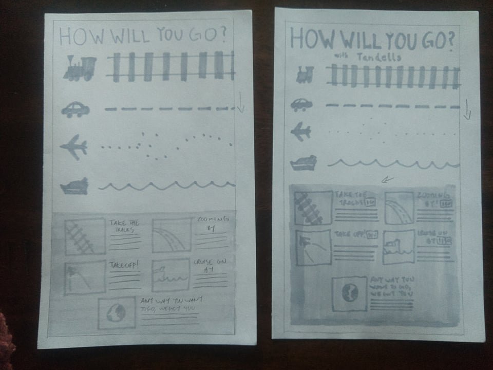
2 Intermediates
With the thumbnails I liked best, I was then able to take those ideas and draw them again in a size closer to what the full print would be so I could really start feeling out what the spacing will be. This was really useful in finalazing the designs and determining which design I wanted to go all the way with.


1 Final
Once I was able to see the intermediates, it was easy to know which one was the best to go forward with. So I then drew it out in it’s full size so I could make some final decisions in the margins, spacing, etc. This was a very fun step, I loved seeing what it would look like in it’s full size since it it very different from the smaller sizes. I was very happy with the design all my work had created.

B&W Computer Progressions
Then it was time to get the layout onto the computer. Using the final as a reference, I made all the text and shapes and since it was now digital, I could now easily mess with shapes and spaces to make it as nice as I wanted to. Then I was able to print out the designs and see them physically, and with some second opinions determined changes that should be made multiple times. All this made it so I could have the finished design be the best it could be. This was a very fun step, possibly my favorite and I’m very satisfied with my final look.


