Poster Designs
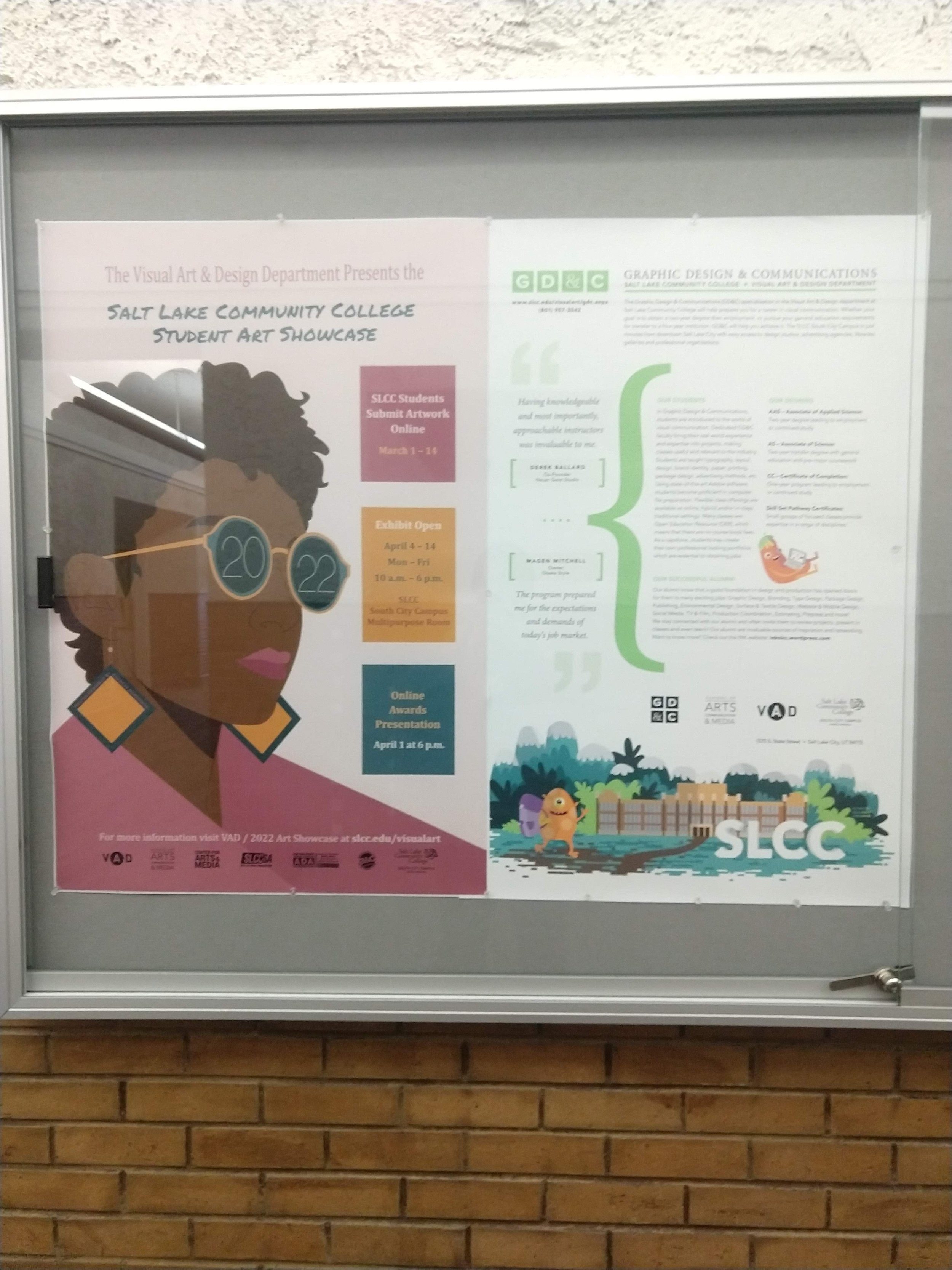
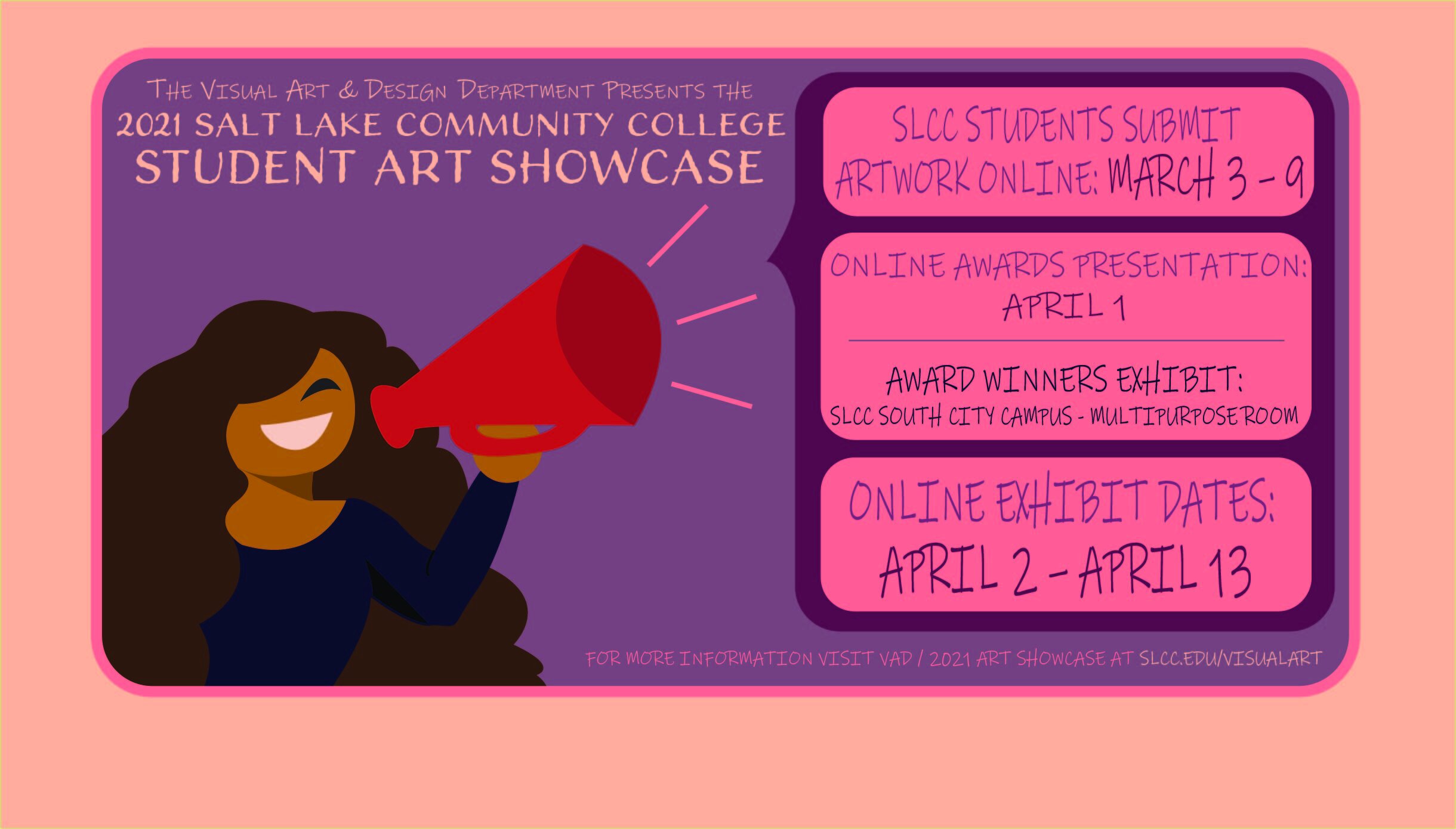
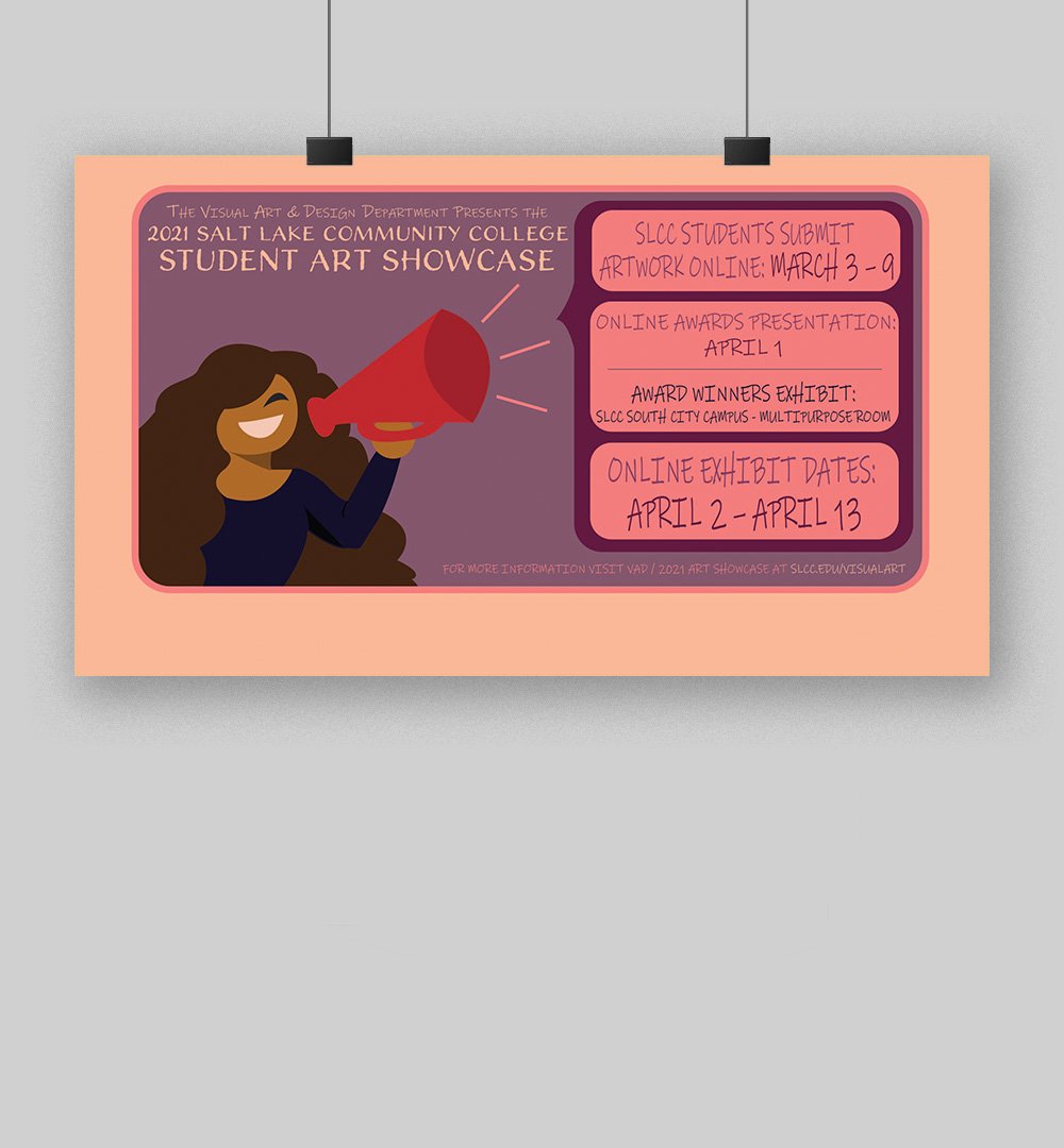
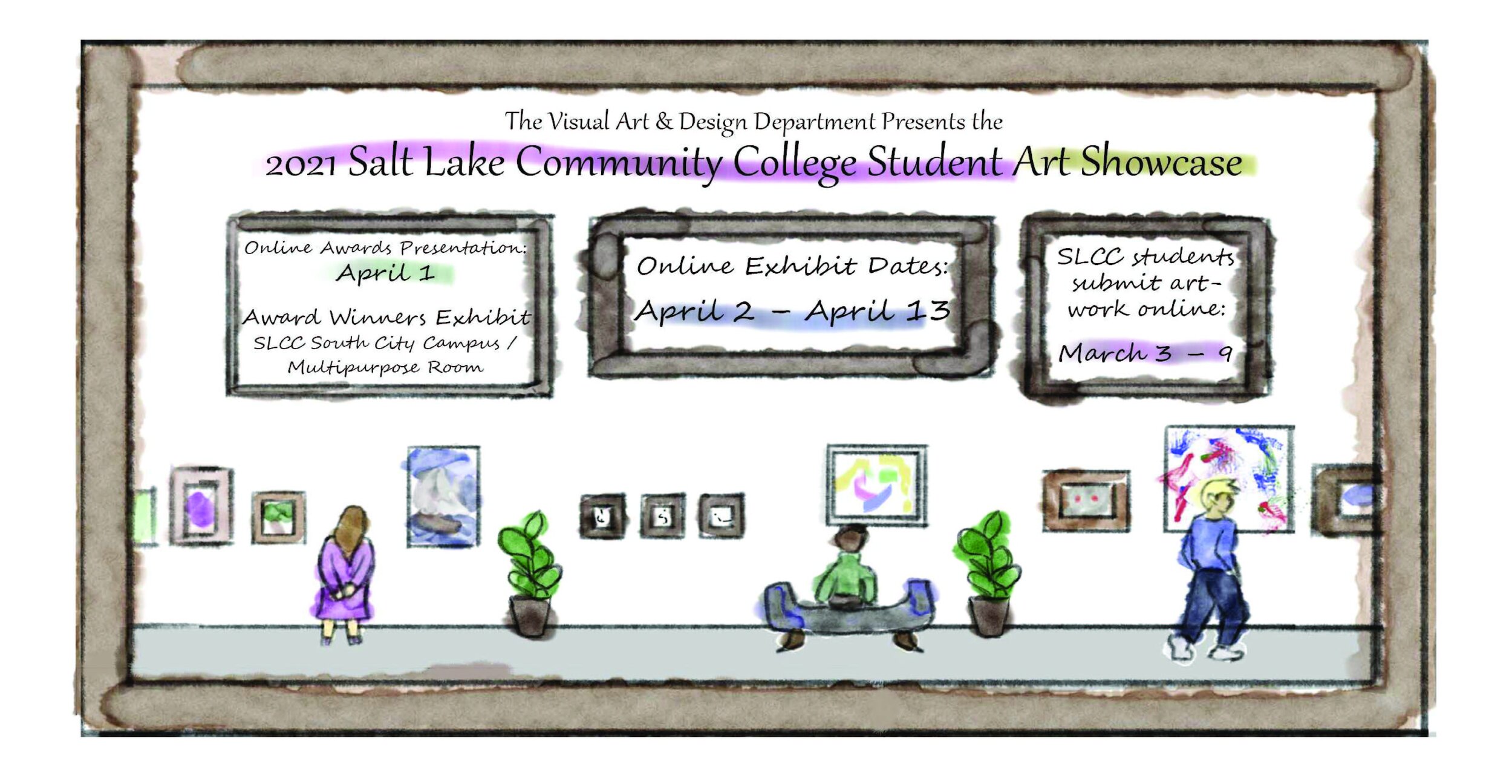
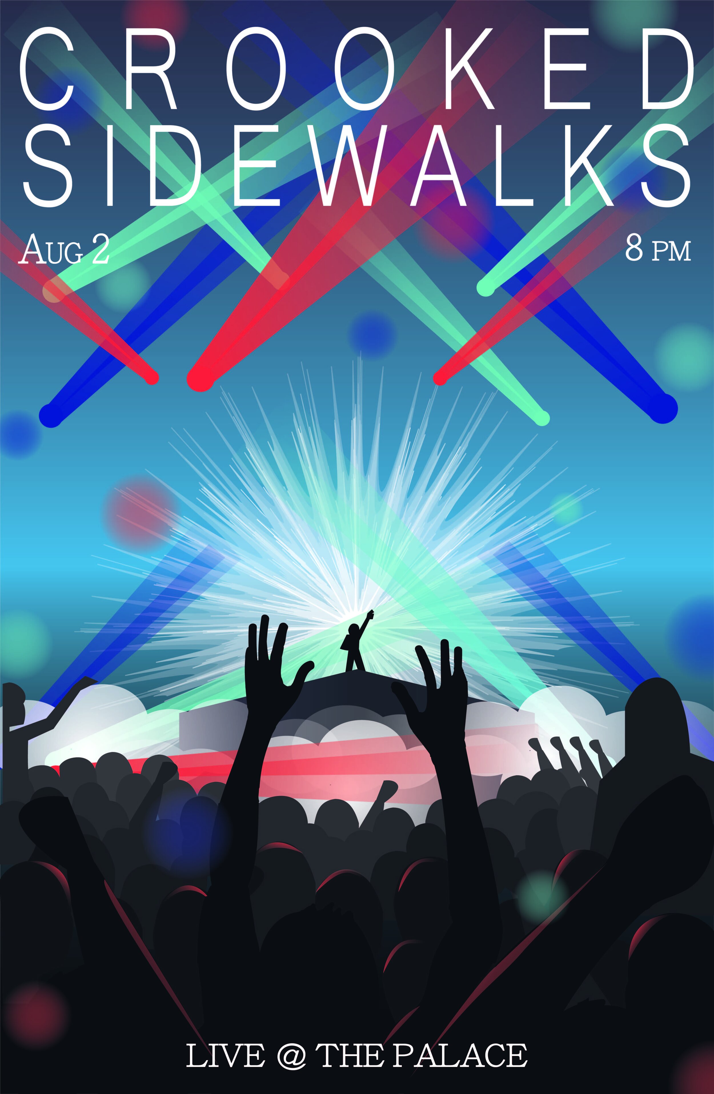
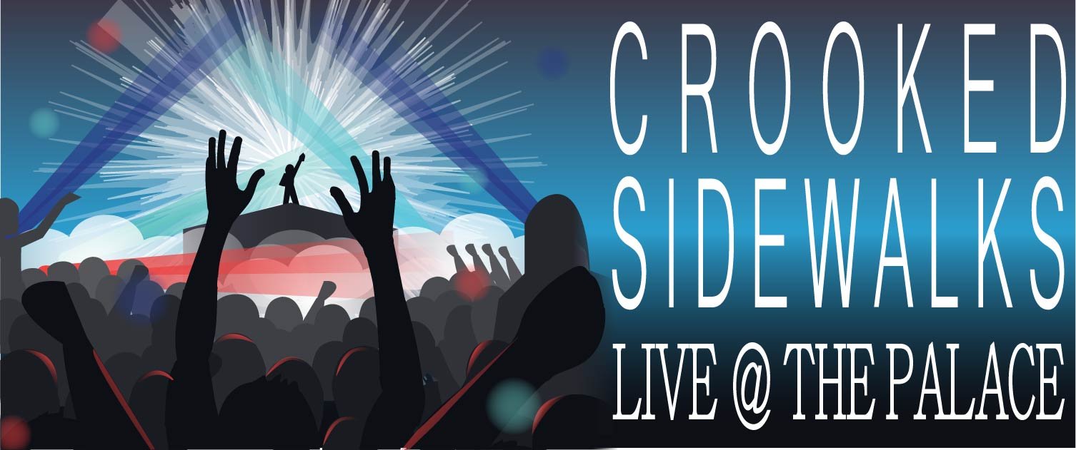
Throughout my school career, I was given lots of opportunities to try my hand and poster design and I had a blast. Many of those opportunities was the Salt Lake Community College Art Showcase that the school puts on every year and has a poster design competition for. The first poster shown here, for the 2022 Showcase, actually won the contest and was used in promoting the art show, which was amazing to be a part of. I have loved trying different poster designs and feel like I could really grow my skills in this way.




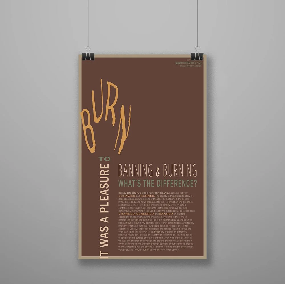
Banned Books Week Poster
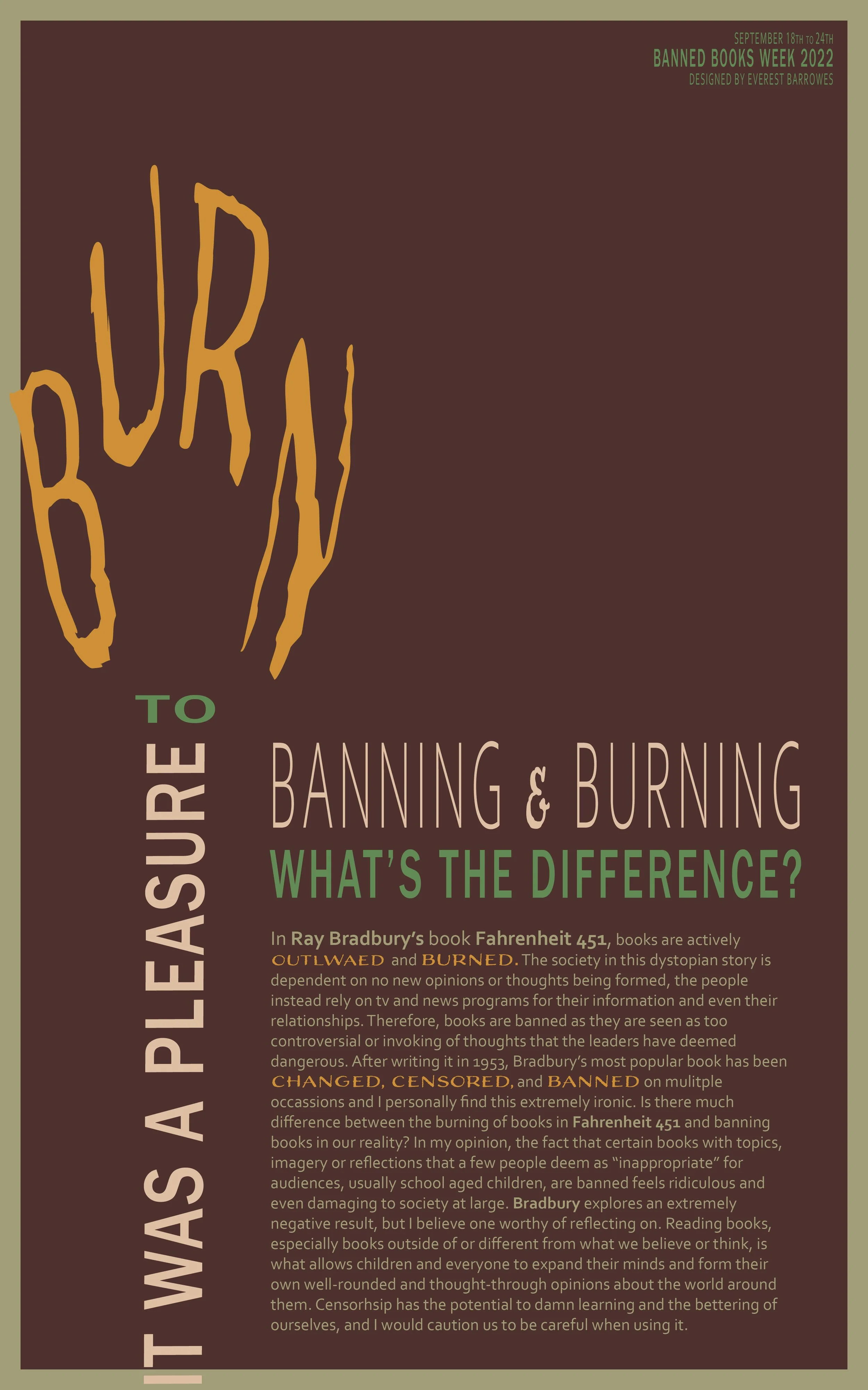
I will go into my process for making this poster. This was created for a project, we were given the theme of Banned Books Week and given the task of making a poster using purely type. Posters have been used in designed for a long time and are one of the most effective ways of conveying a message quickly and powerfully. This was a great opportunity to really look into a topic I could be passionate about and create something to convey what I have felt and learned.

Research & Brainstorming
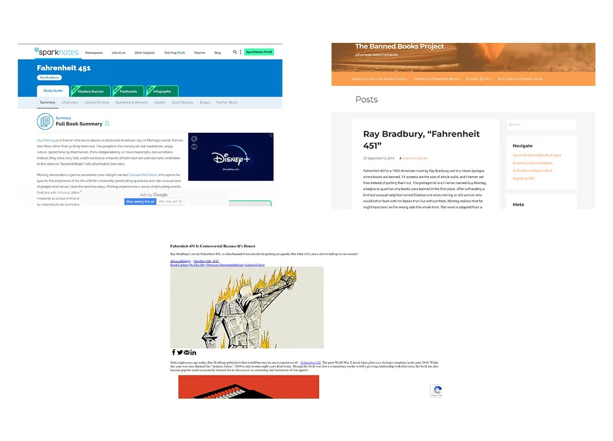
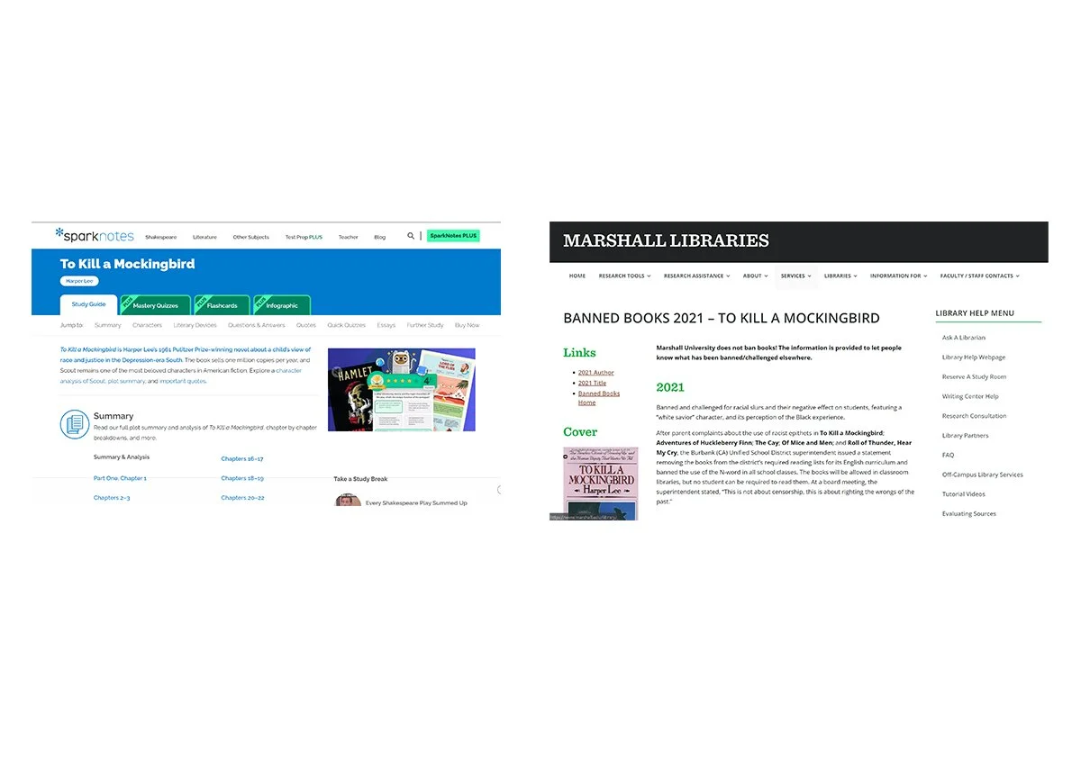
Of course, we must begin with figuring out what the heck we’re going to do. I found it very fun to look around at other examples of things people have done with just type, you really can do so much! And then it was super helpful to look into books that I was already interested in and dig in more, remembering what they’re about and finding out why they have been banned. This helped in figuring out headline and writing ideas.


Sketches & Doodles
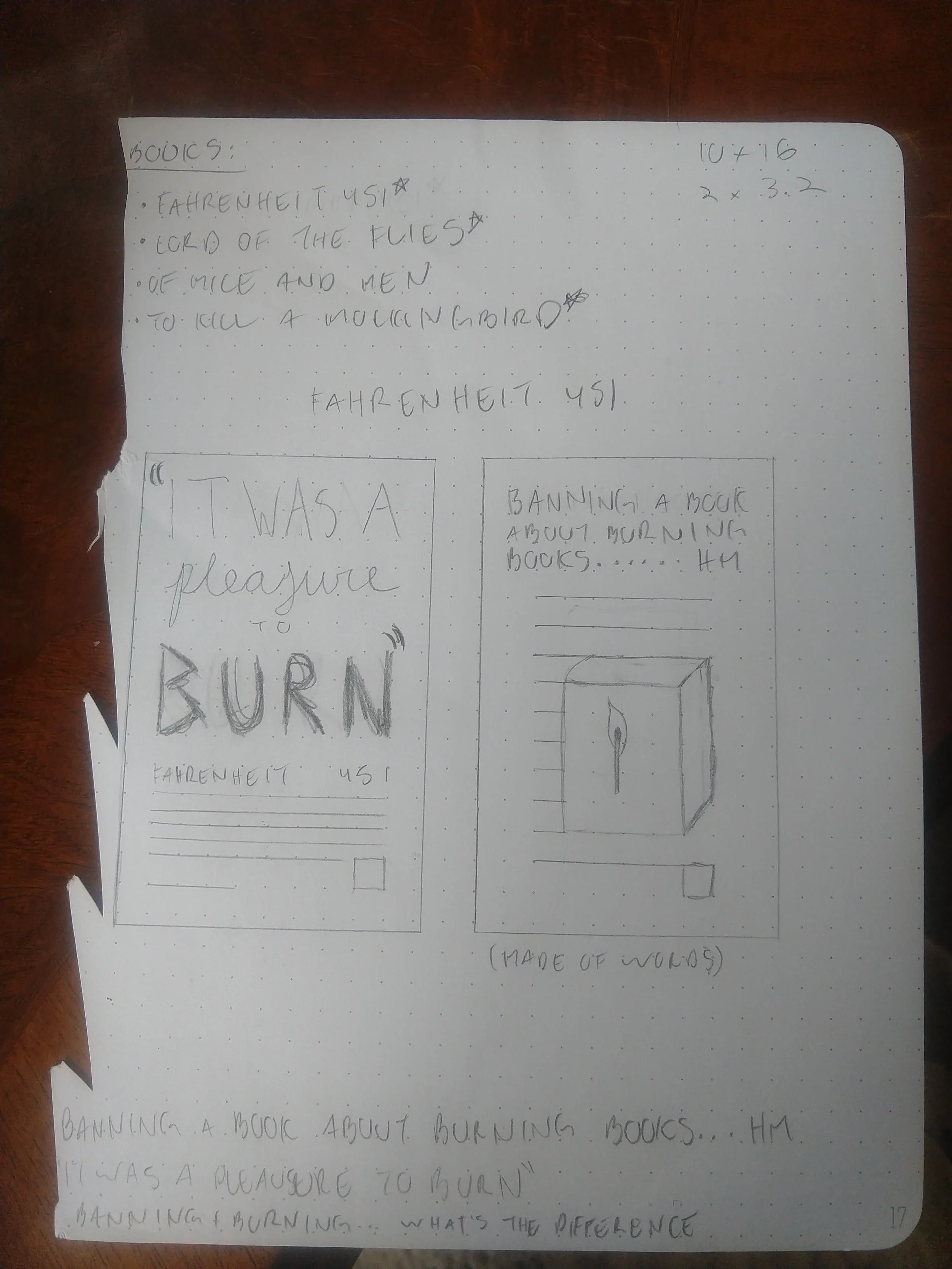
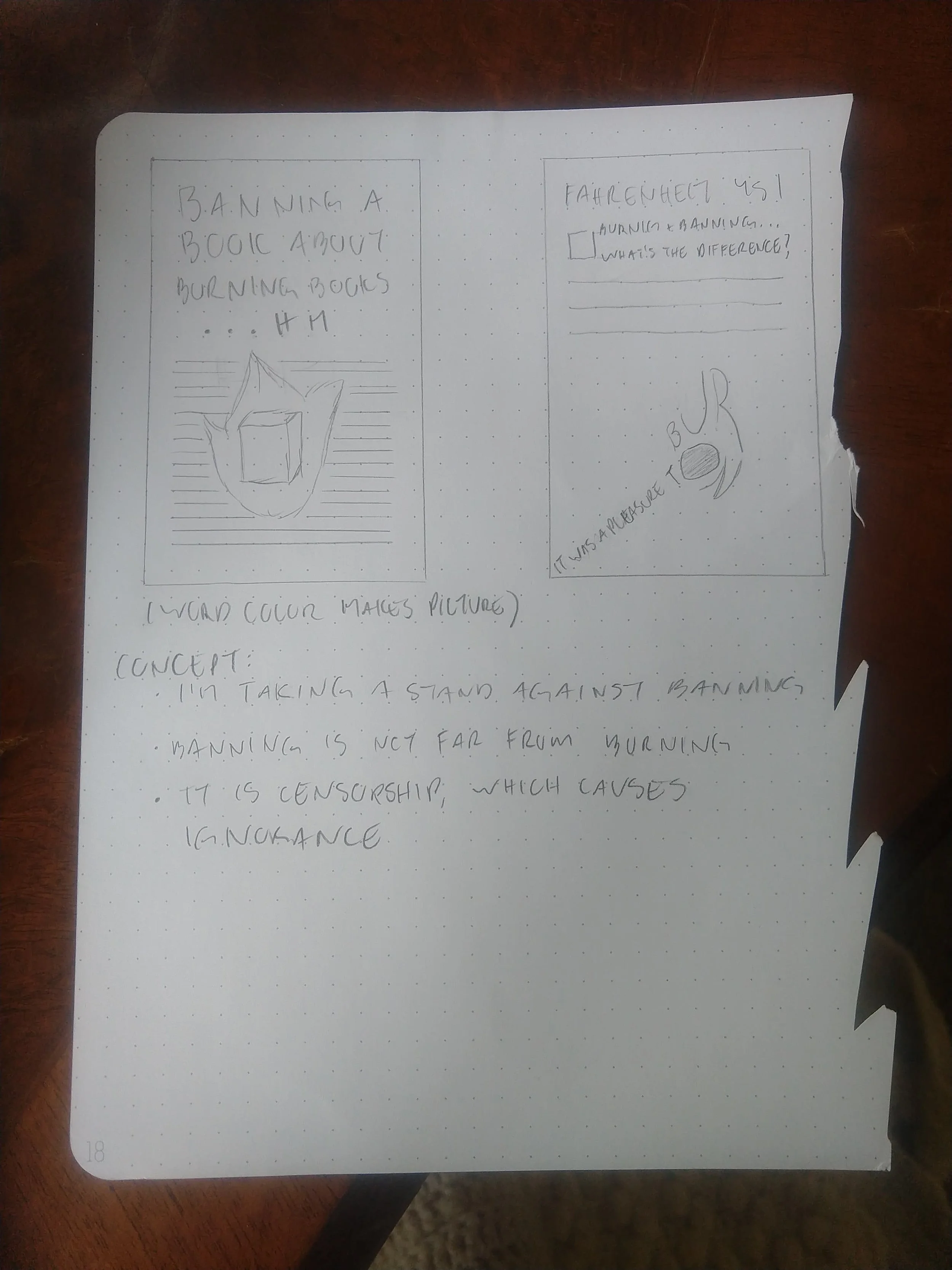
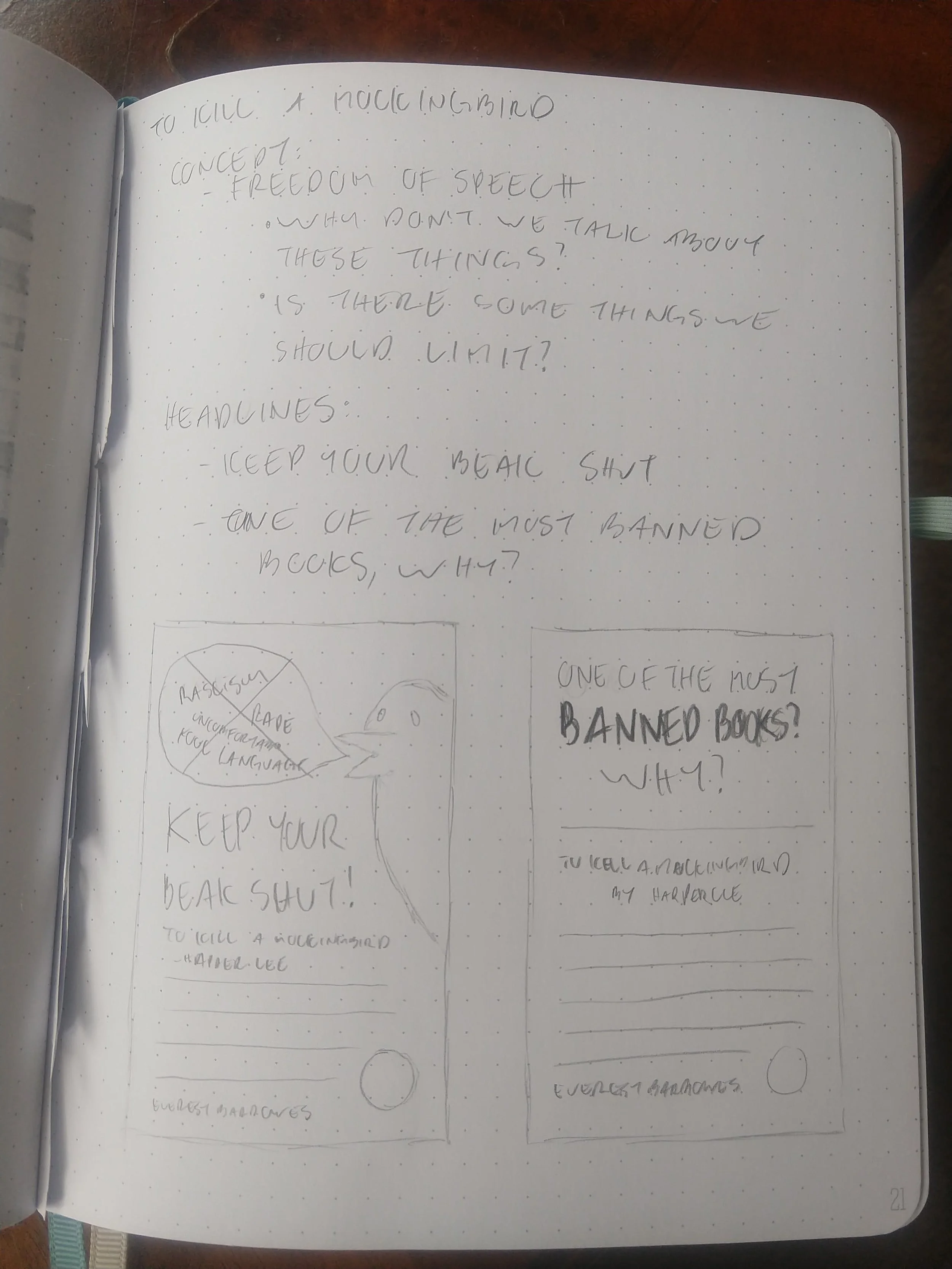
Once I started getting some ideas of directions I could go, it was time to start getting those ideas down on paper. This is one of the most helpful stages of the designing process and one I took some time in. It’s helpful to see what ideas look like right away and makes it so deciding what to move forward with is a bit simpler.
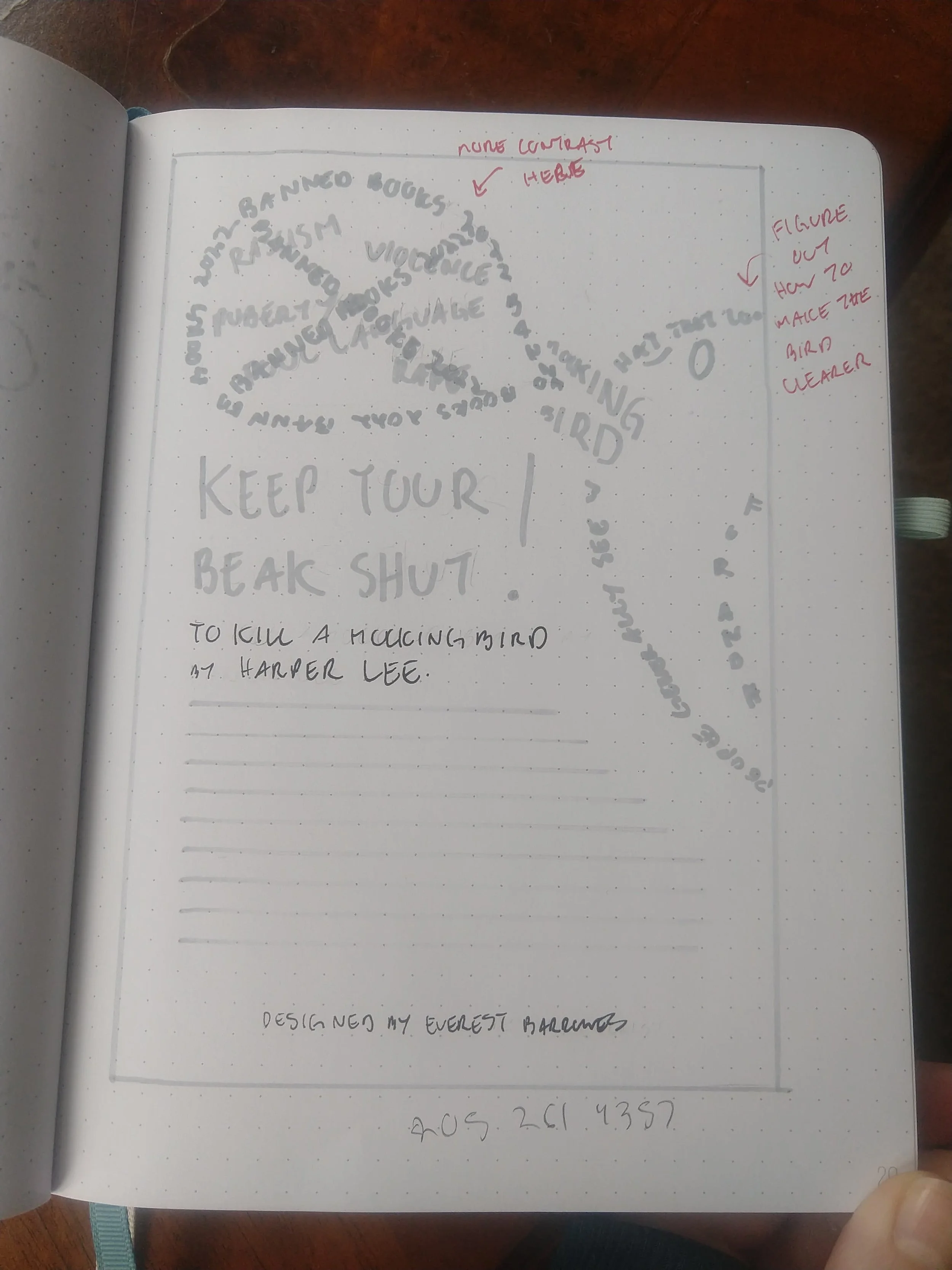
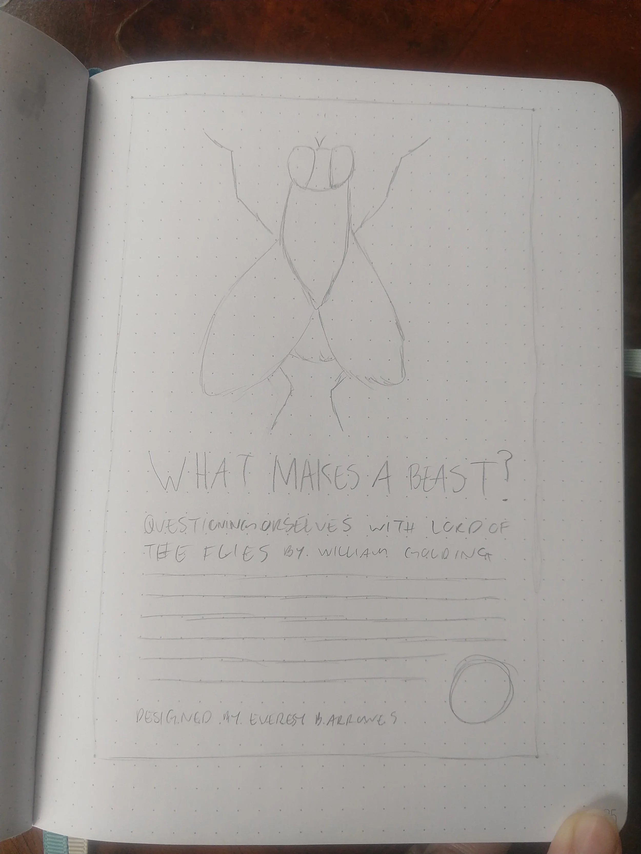
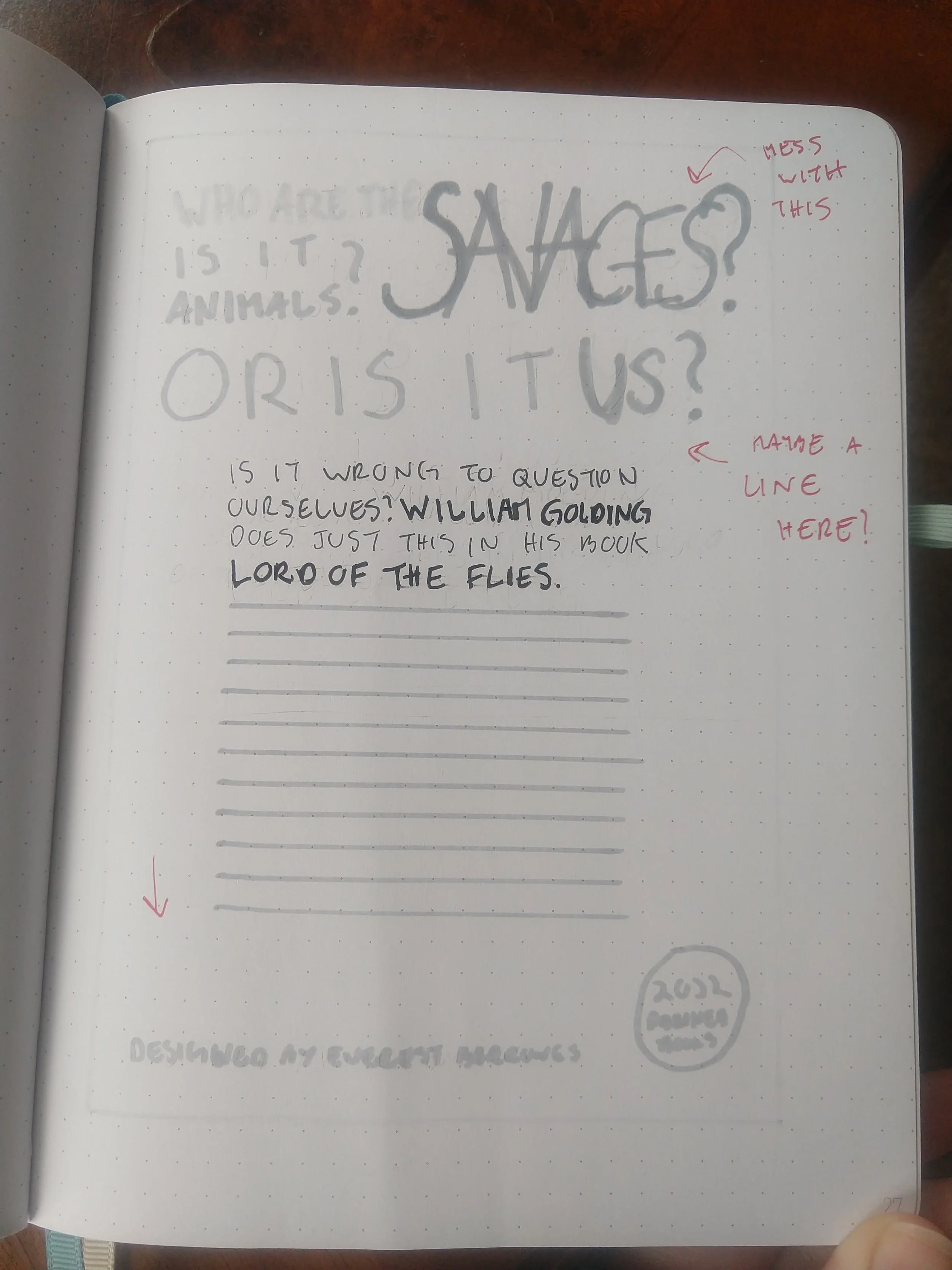
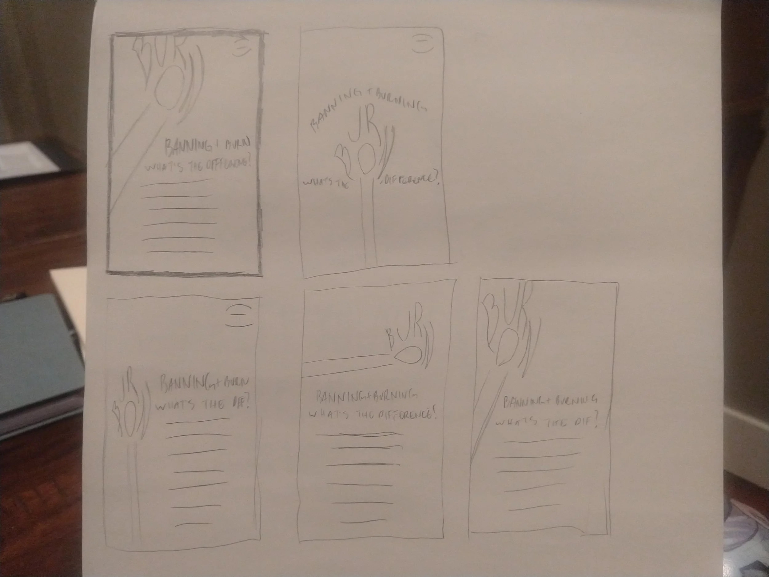
3 Thumbnails
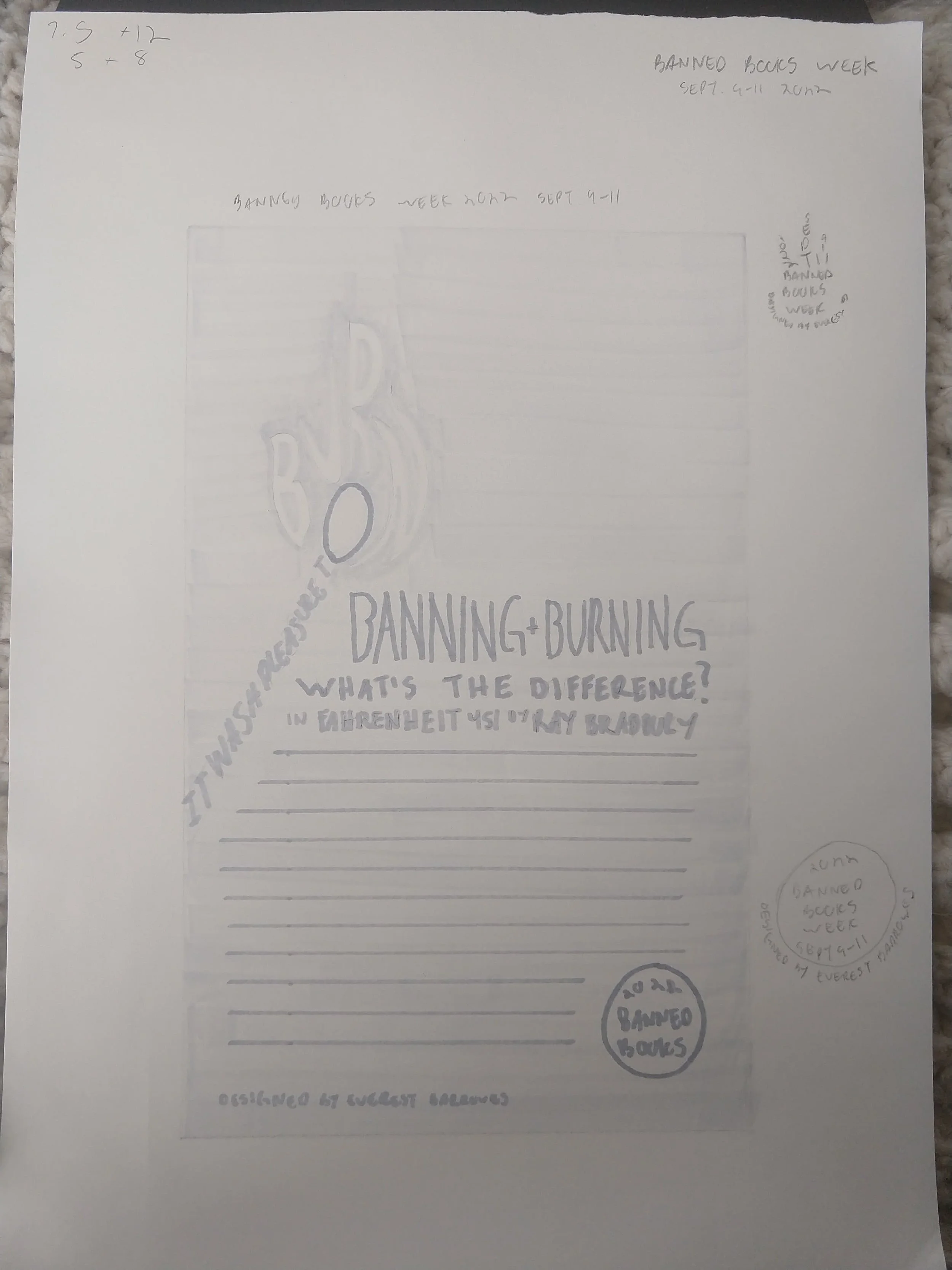
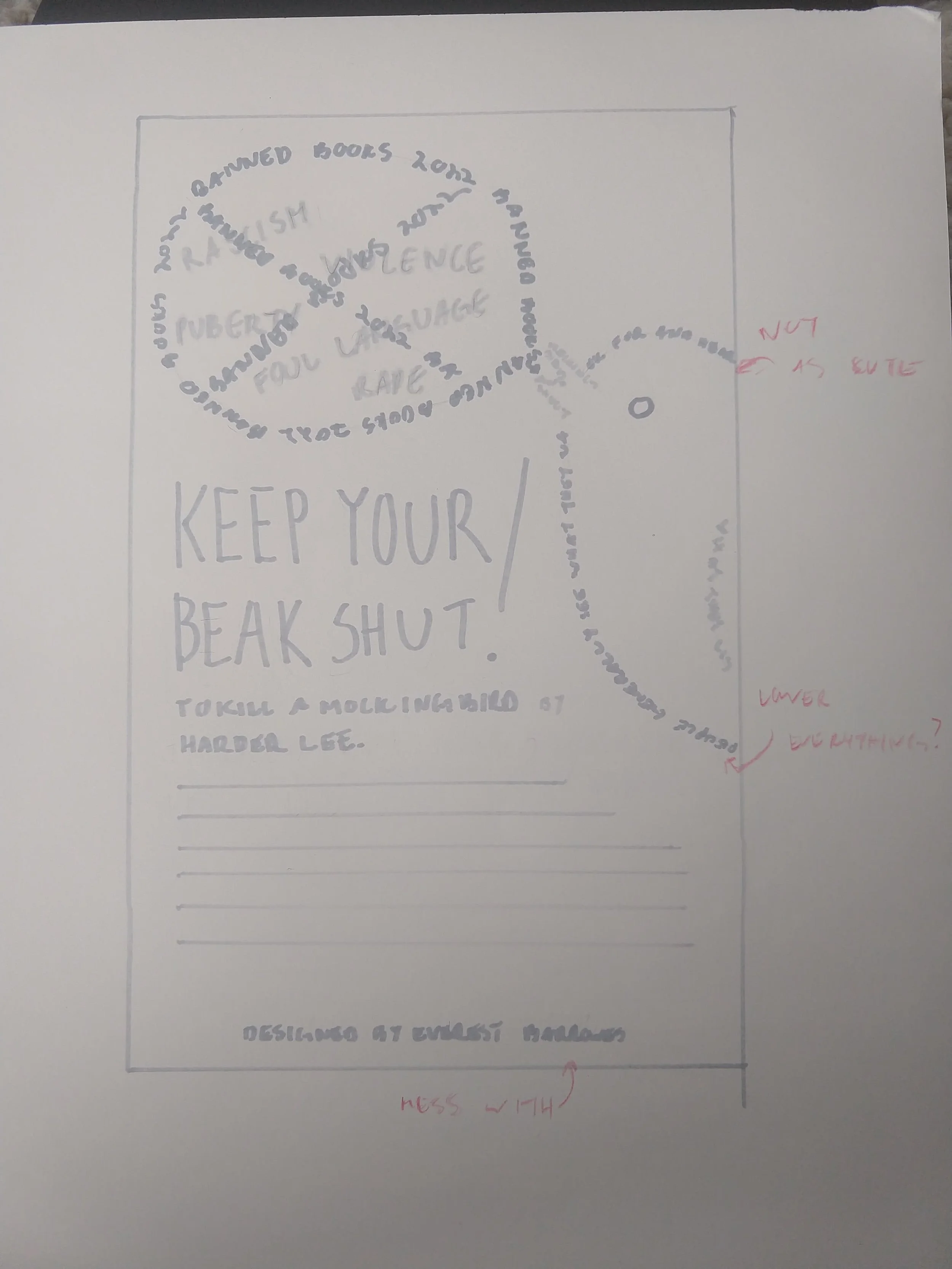
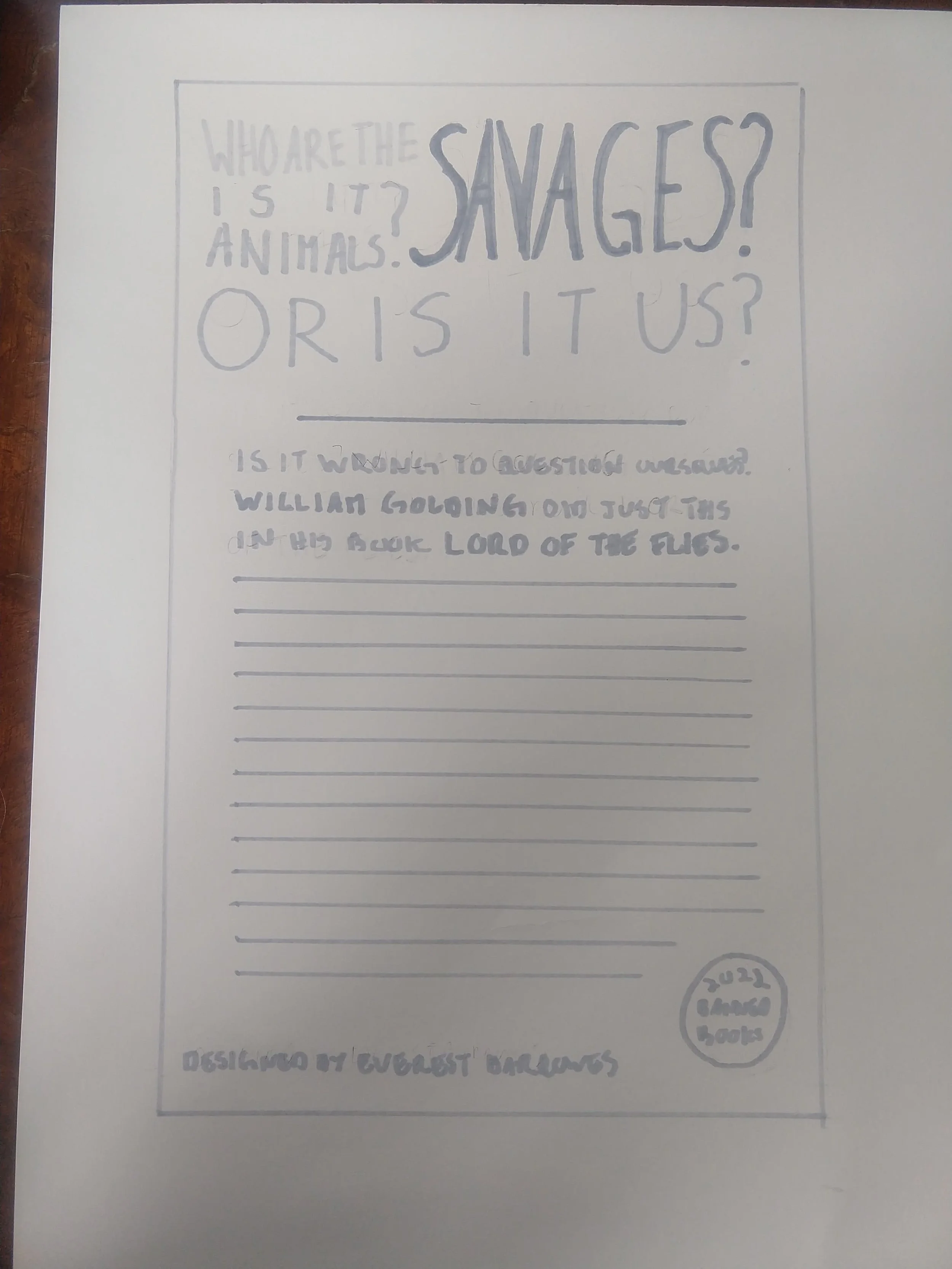
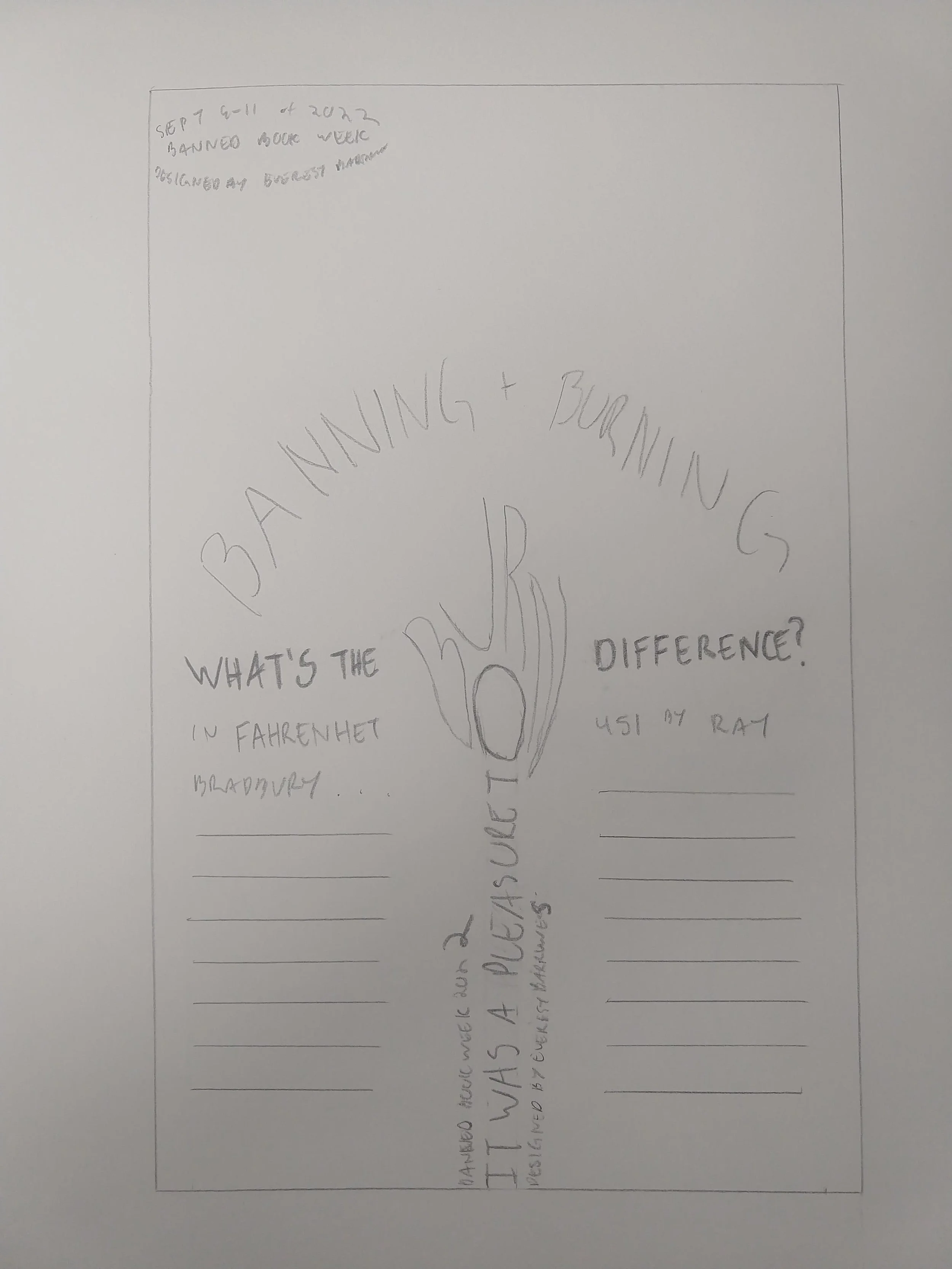
As you can see, I have more than three thumbnails. I had three originally but then I wasn’t satisfied with how those looked. I wanted to mess with them and figure out more solidity what I wanted them to look at them before taking them to the next step. And even then I didn’t try enough variations, but it was helpful to try more things and see what worked better.
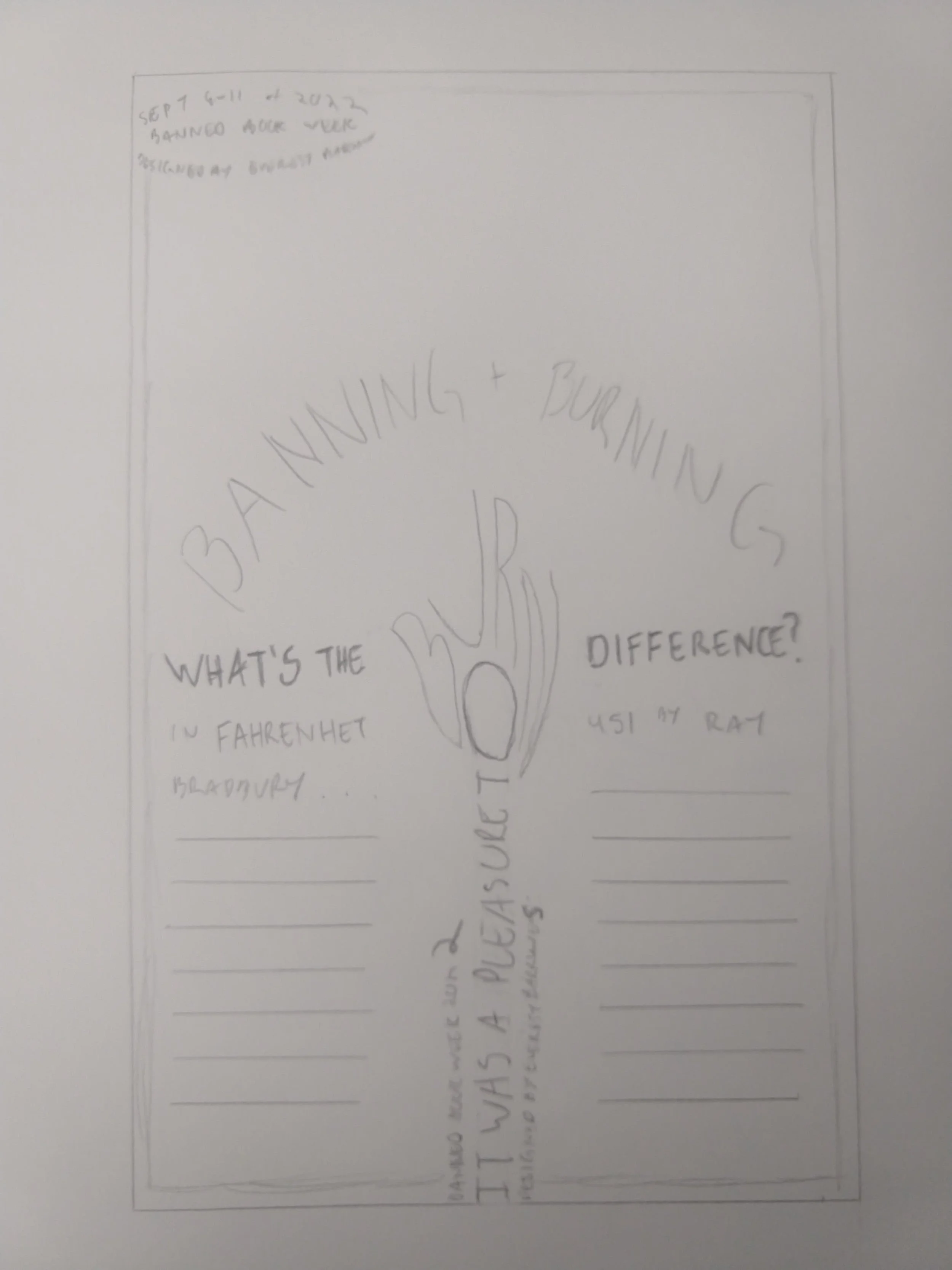
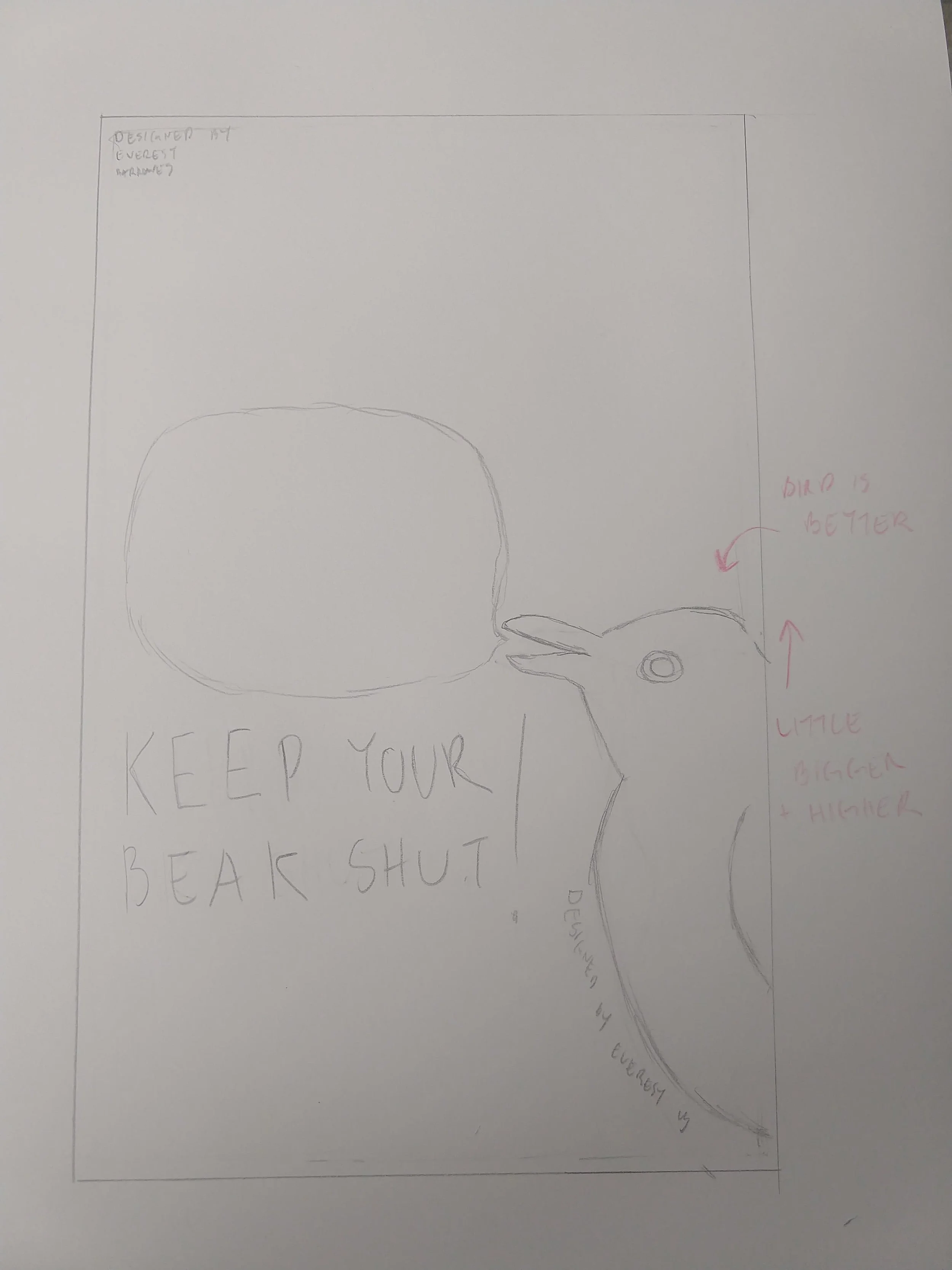
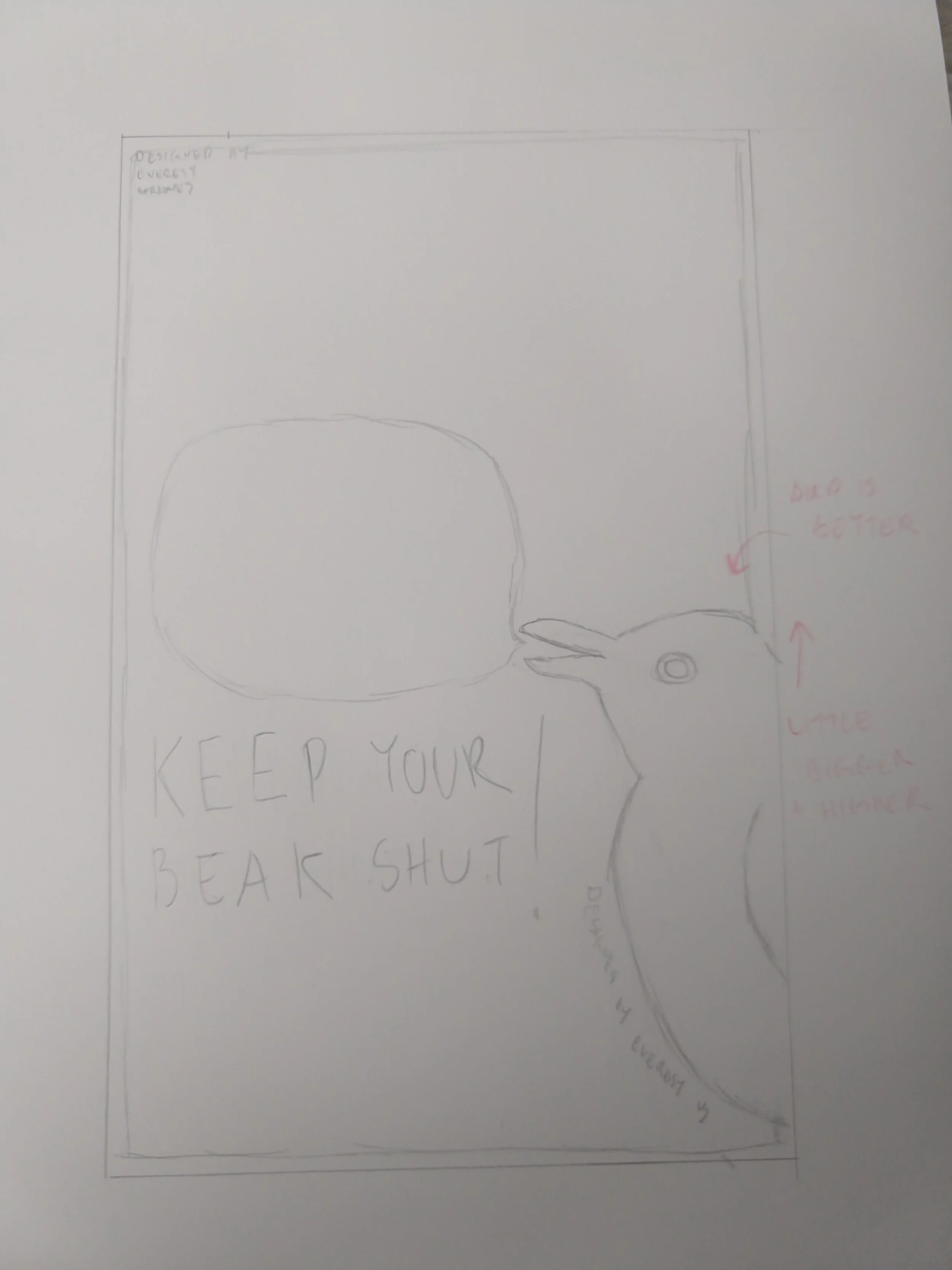
2 Intermediates
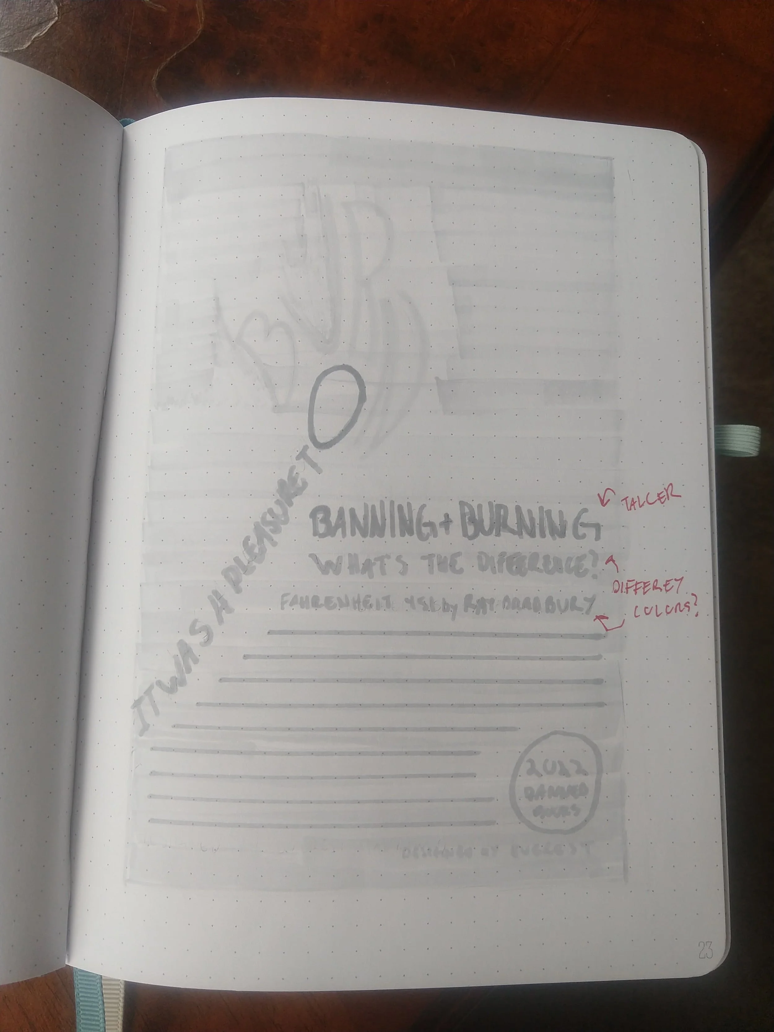
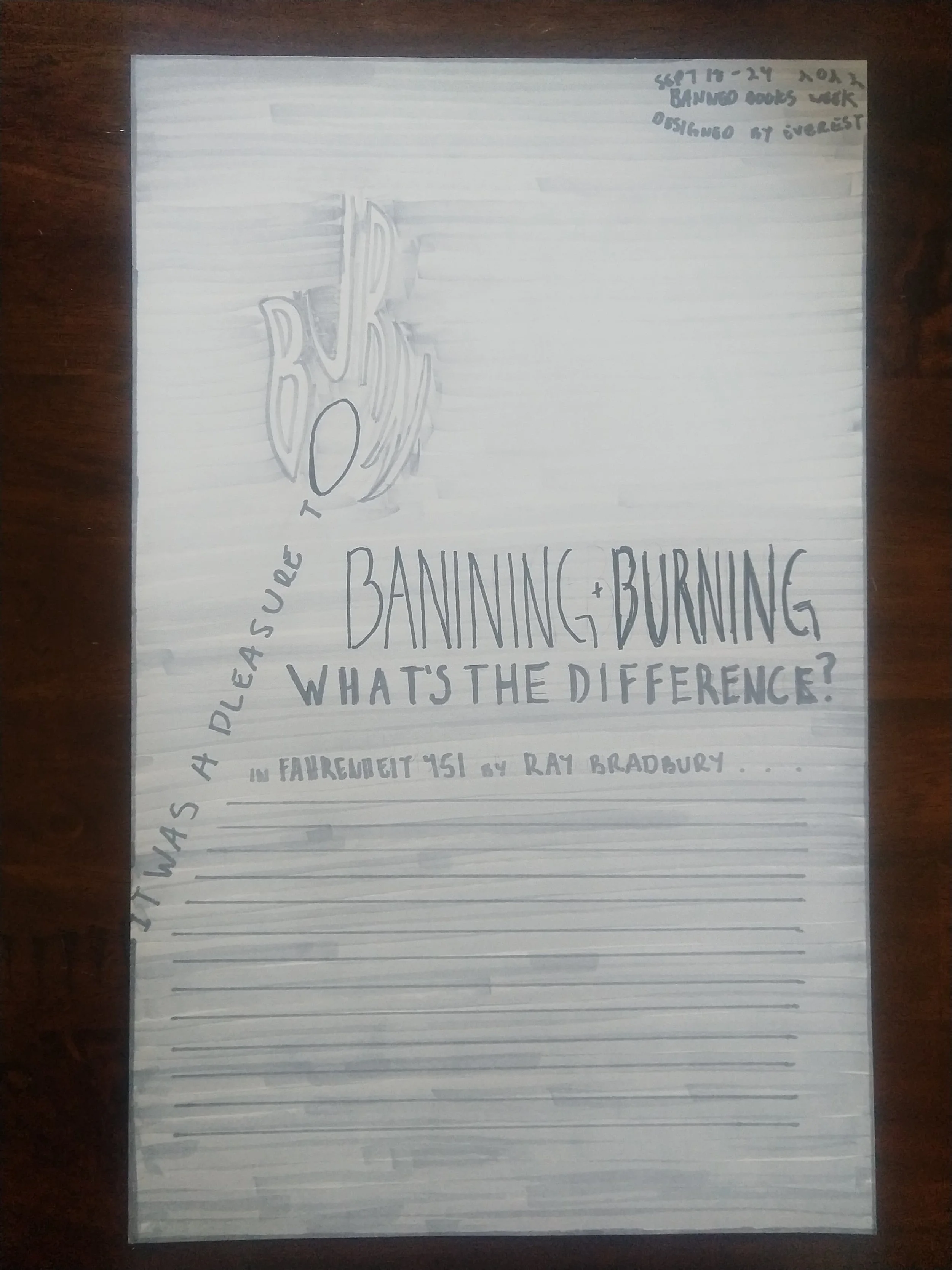
After figuring out through the thumbnails what designs I wanted to go forward with, it was time to really get down the spacing and look I wanted. I’m not the best at the stage yet and want to be cleaner with my work, but nonetheless it’s still very helpful to see things get bigger so you get a better idea of how the layout works.
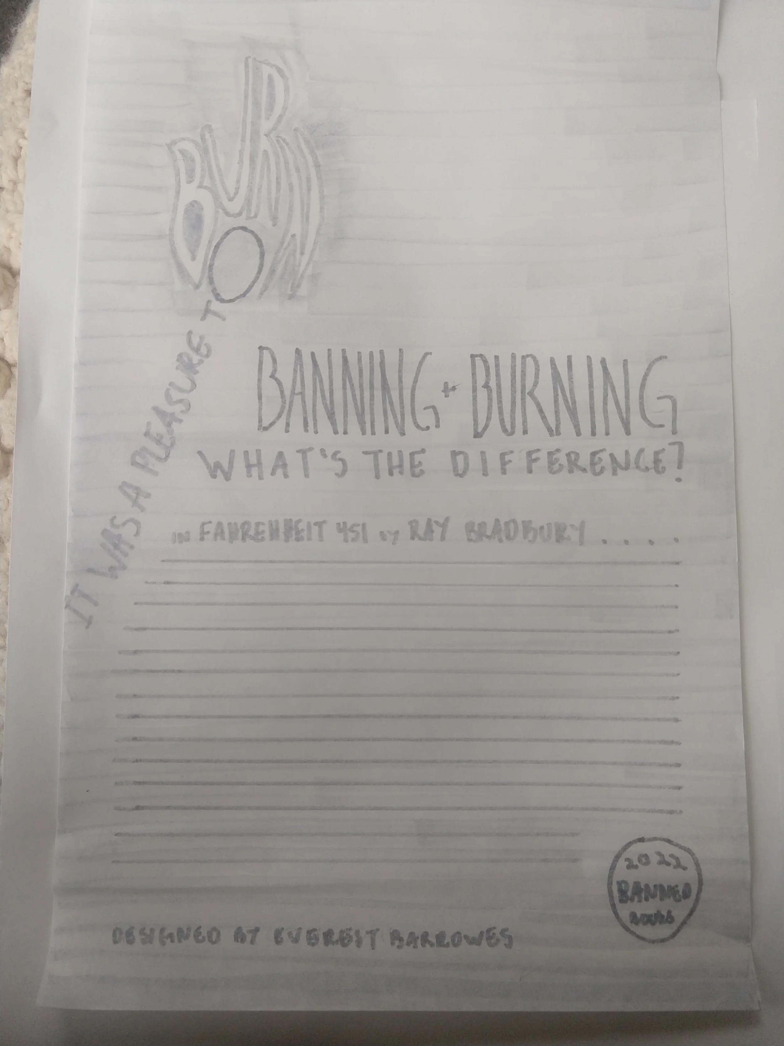

1 Final
I don’t actually go forward with this exact layout, I ended up doing more doodles to decide on what layout I truly wanted, but this was still an important step to figure out what I wanted. It gave me the general, firm idea of what design would be best to bring to the computer.
B&W Computer Progressions
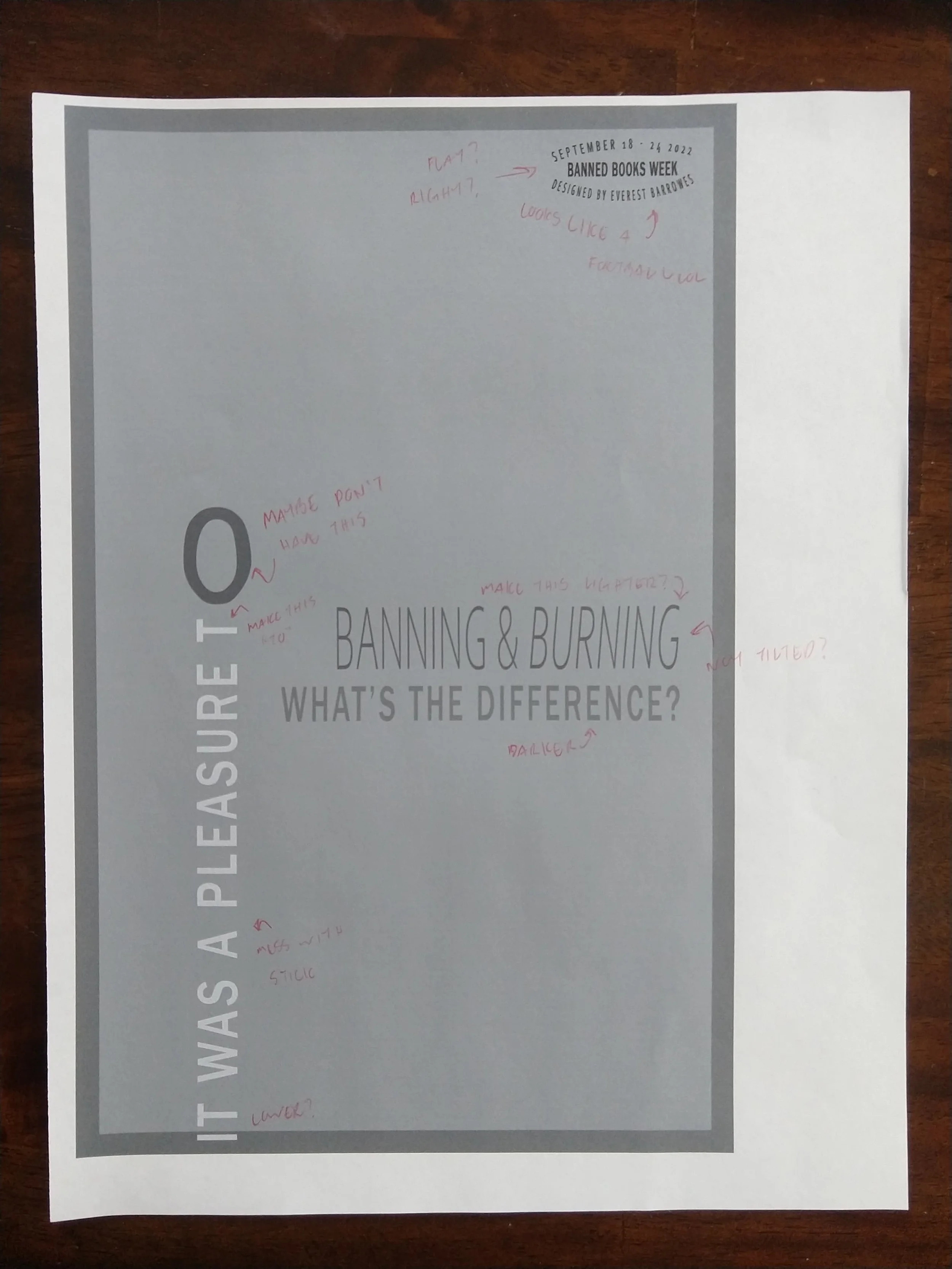
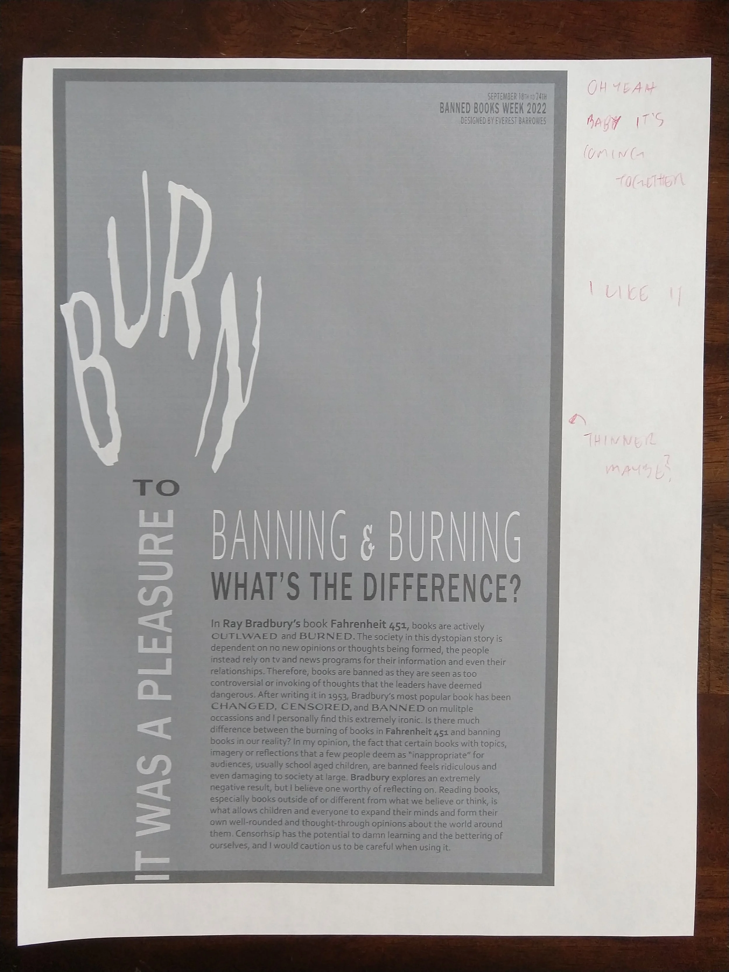
I love this step, it’s fun to get the design on the computer and really see it start to come together. I love how easy it is to make changes on the computer and seeing the spacing and design with it really helps in deciding what looks best. Writing down the changes I love doing too, it’s nice to actually see where they need to be.

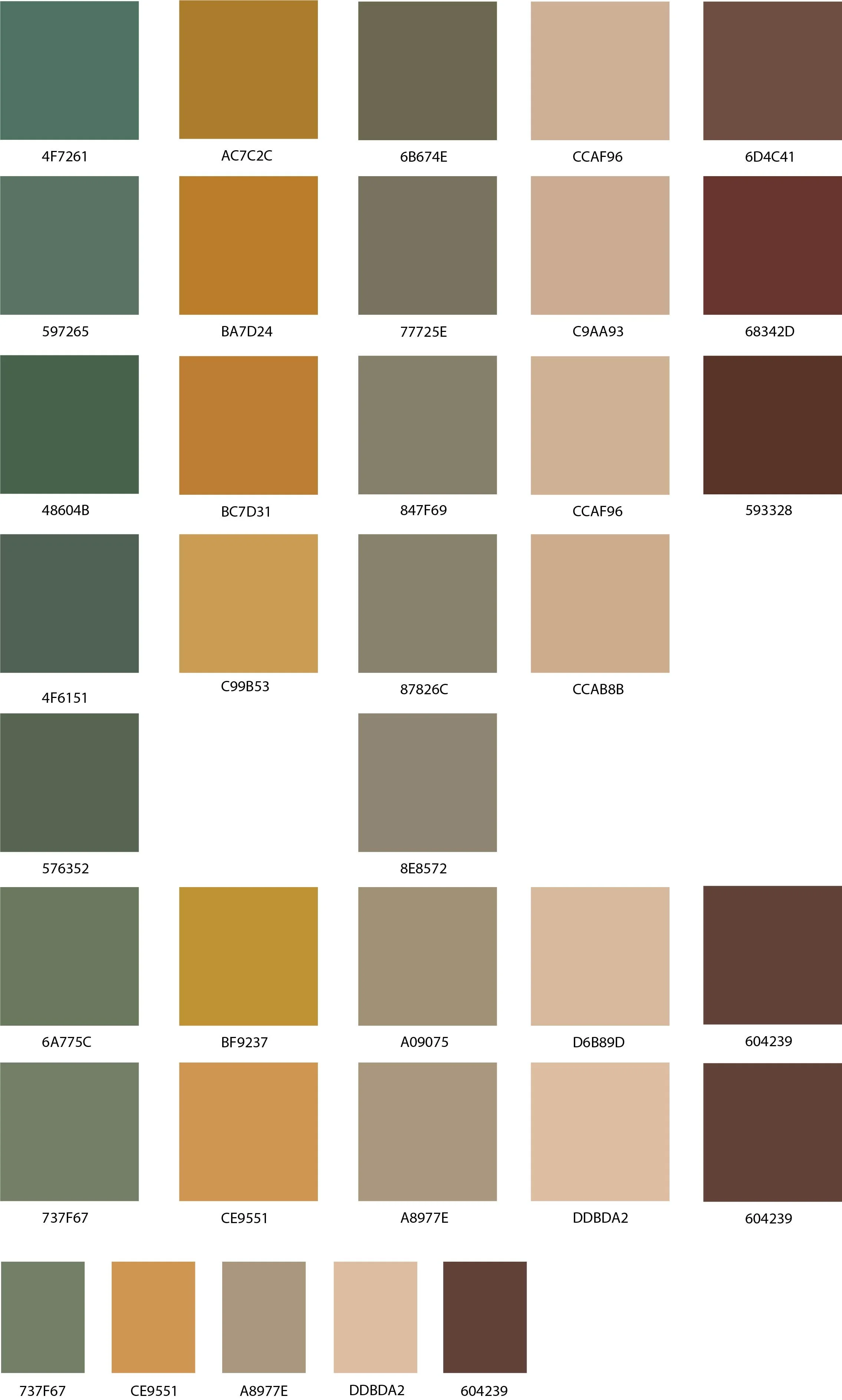
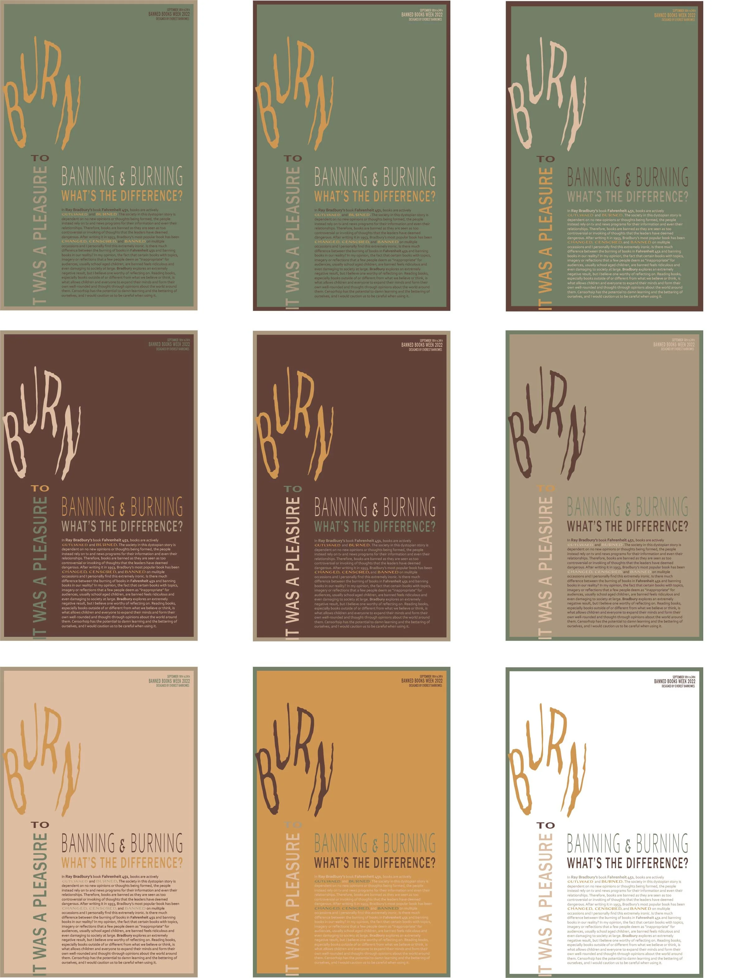
Color Studies & Mini Applications
This part was so frustrating but so fun. Matching the colors was definitely the hardest part, and I still don’t know how well I did, but it helped me learn a lot about the difference between screens and different papers. Once I figured out the colors though, figuring out how best to use them was one of the best parts. I loved trying out all the different combos and using my own and other’s opinions to decide what would be the best to put onto the full poster.
